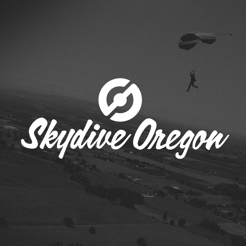
CLIENT: SKYDIVE OREGON
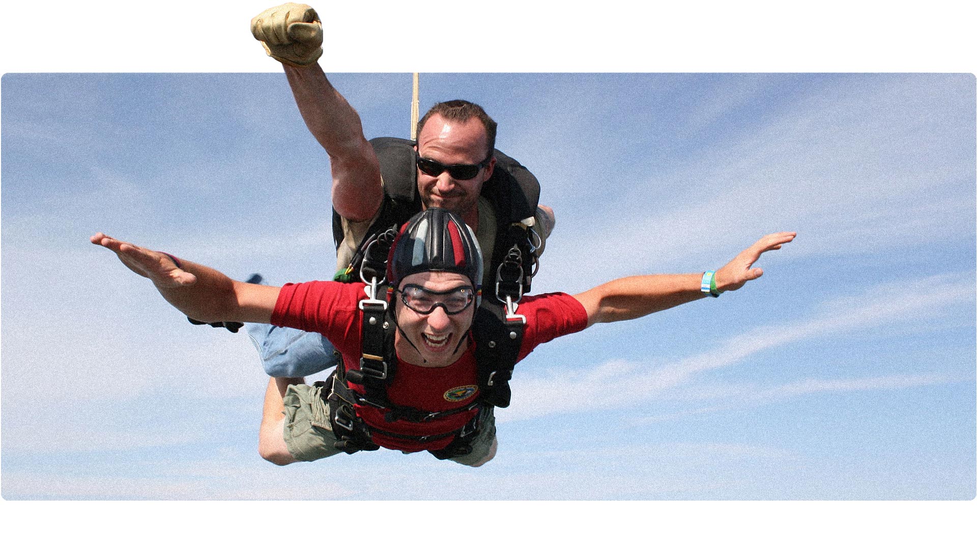
I took the leap
from 14,500 feet!
In that exhilarating blend of trepidation and anticipation, I recognized the calling that demanded my attention. It was clear that this brand required a revitalization that captured the sheer joy and excitement I felt soaring through the skies, while maintaining a sense of professionalism and trustworthiness. And let me assure you, I wholeheartedly embraced the challenge, taking the leap with unwavering determination. Watch my first time skydiving >
BRAND STRATEGY
LOGO DESIGN
BRANDING
WEB DESIGN
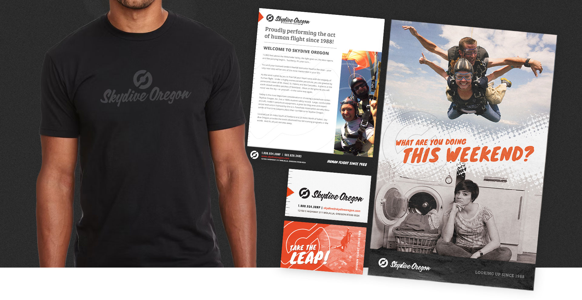
PRINT COLLATERAL
BRANDING
In search of
the perfect mark.
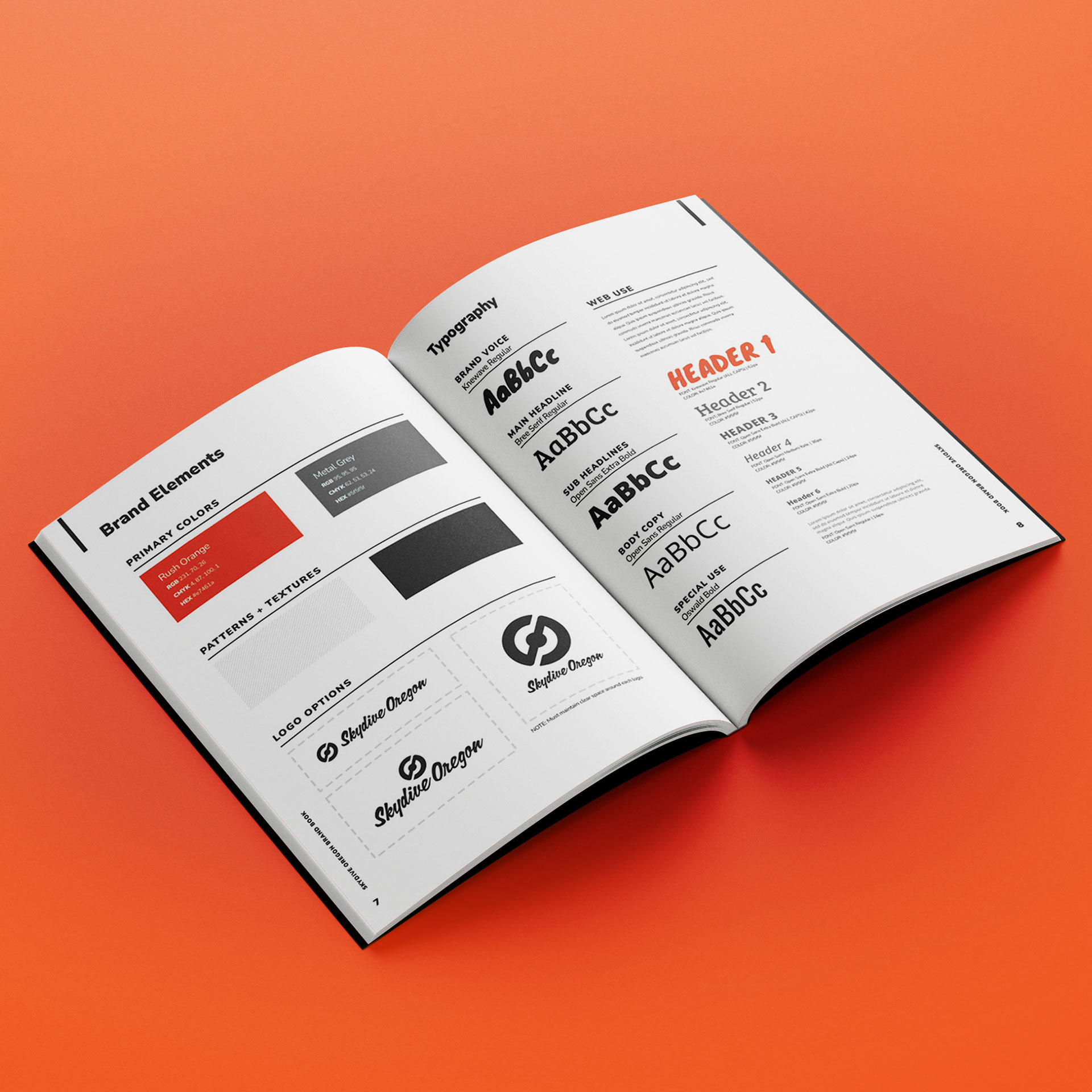
By making strategic tweaks, we created a timeless logo that works well in both print and digital formats. The icon represents 'S' and 'O' for Skydive Oregon, along with propeller-like elements, resulting in an iconic design that even shines in small social media posts.
WEB DESIGN
A fresh perspective on digital.
With the updated logo and brand treatment in full flight and prominently displayed across various platforms, it was time to unleash our revitalized brand into the digital realm, ensuring its visibility and impact for all to experience!
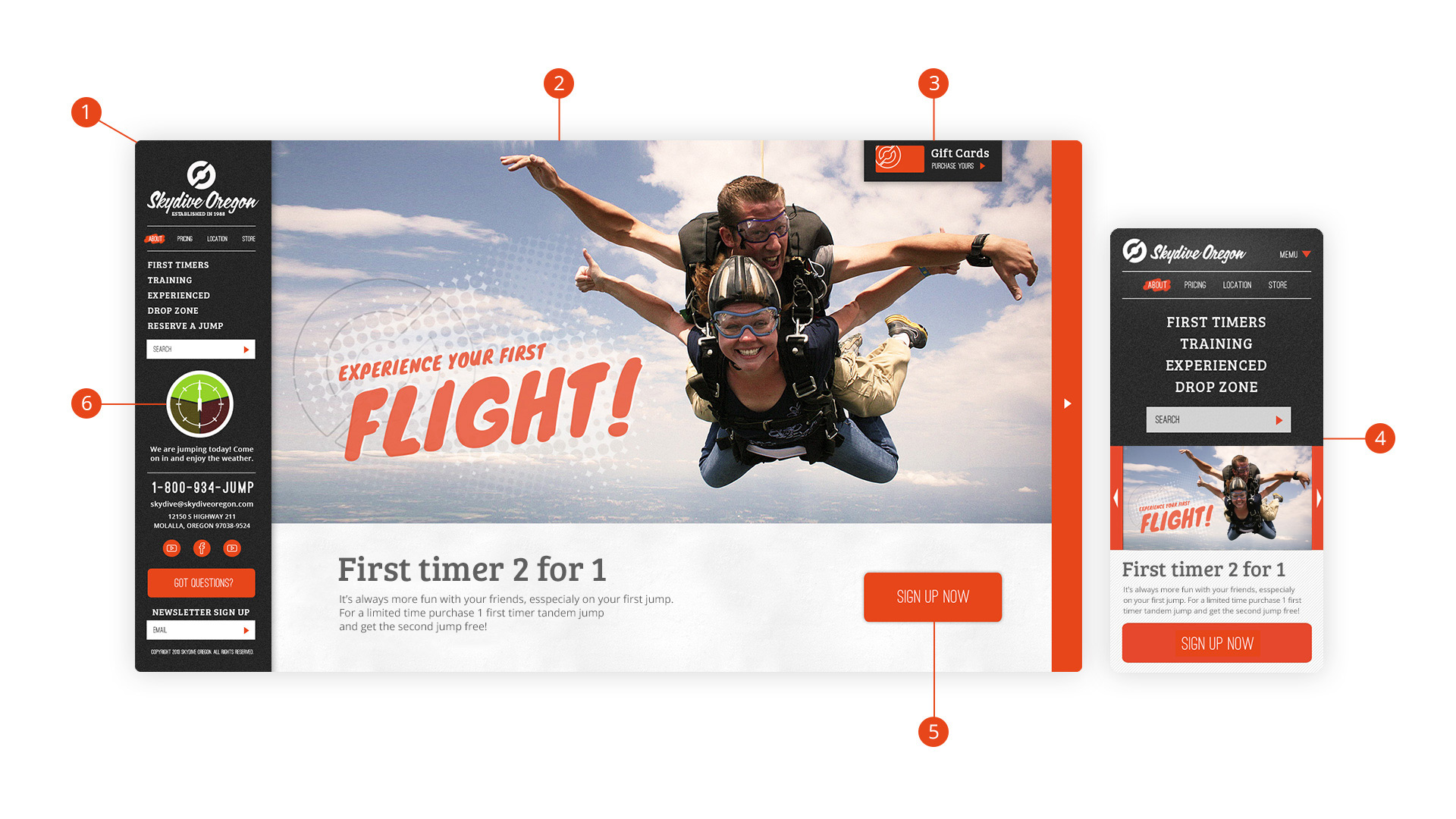
1
Persistent Navigation
Drawing inspiration from the functionality of a plane's cockpit, we aimed to empower users with complete control over our website. To achieve this, we implemented a left-aligned mega menu, strategically placing nearly all essential features in one easily accessible location
2
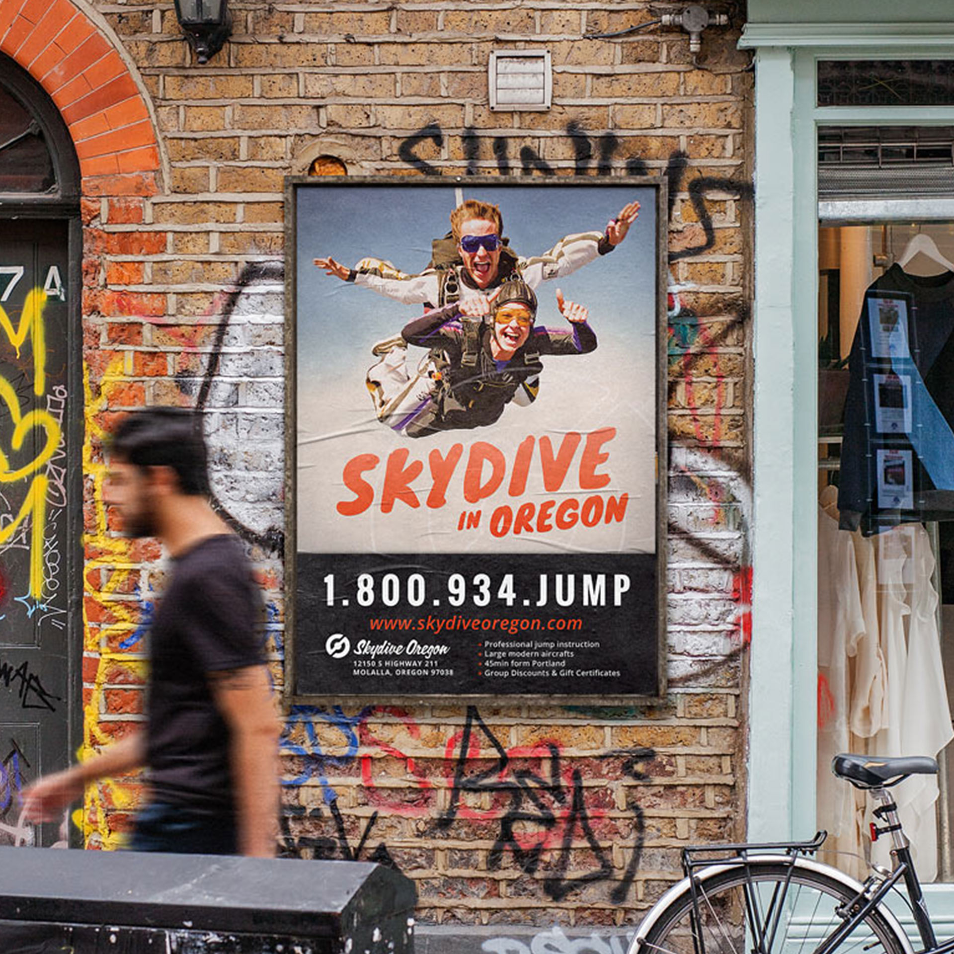
Selling the Experience
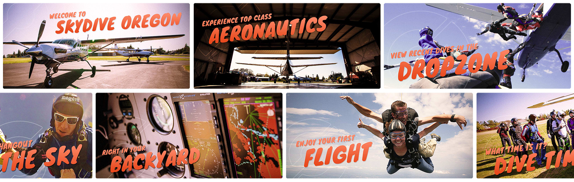
After my own skydiving adventure, I knew the key to capturing the essence of skydiving was through immersive visuals. That's why we created a full-screen carousel featuring awe-inspiring skydiving images, maximizing the impact and excitement for our website visitors.
3
Simple Tabs
Recognizing the immense popularity of gift cards as a means to entice people into experiencing the thrill of skydiving, I made sure to prioritize their accessibility. To achieve this, I implemented a dedicated and easily accessible tab at the top of the screen, ensuring users can effortlessly purchase gift cards with convenience and speed.
4
Responsive Design
After analyzing the website's traffic, we discovered an equal distribution of user visits between desktop and mobile devices, emphasizing the need for responsive design. It became imperative to ensure that the site delivered an equally seamless user experience on both mobile and desktop platforms, making it accessible and user-friendly across all devices.
5
Call to Action
I prioritized user-friendliness by incorporating large orange buttons as easily clickable targets. Additionally, each slide in the homepage hero slider features a prominent call-to-action button, providing clear direction to users without any need for searching.
6
Special Features
Introducing the revolutionary "Jump Gauge"! Our client's time-consuming weather-related inquiries have been eliminated with this user-friendly feature, allowing visitors to quickly check if it's a suitable day for skydiving, resulting in a more streamlined and enjoyable experience for all.

RESULTS
Since completing the project, I have received a continuous stream of compliments on the new branding and website. The evolution of this brand into a more vibrant and energetic experience has been particularly well-received, with users expressing their enjoyment. Additionally, the user-friendly nature of the website has garnered praise, and the "Jump Gauge" feature has been widely loved and appreciated by all.
TAKE AWAYS
Working on this project was an absolute joy for me, as it perfectly aligned with my personal passion for extreme sports. If I were to suggest an improvement, I would have advocated for incorporating more video content, although there is still potential for that to be added in the future.