CLIENT: M-Bank
Community-driven banking.
M-Bank stands as a unique banking institution, purposefully crafted from its foundation to uplift and empower the local community. Whether you are a business owner or a neighbor next door, M-Bank offers tailored banking solutions to foster your financial success. Initially, I approached this project with skepticism, perceiving it as just another bank endeavor. However, as I delved deeper into their mission and values, I wholeheartedly embraced the opportunity to provide them with the brand and website befitting a genuinely community-oriented bank.
BRAND STRATEGY
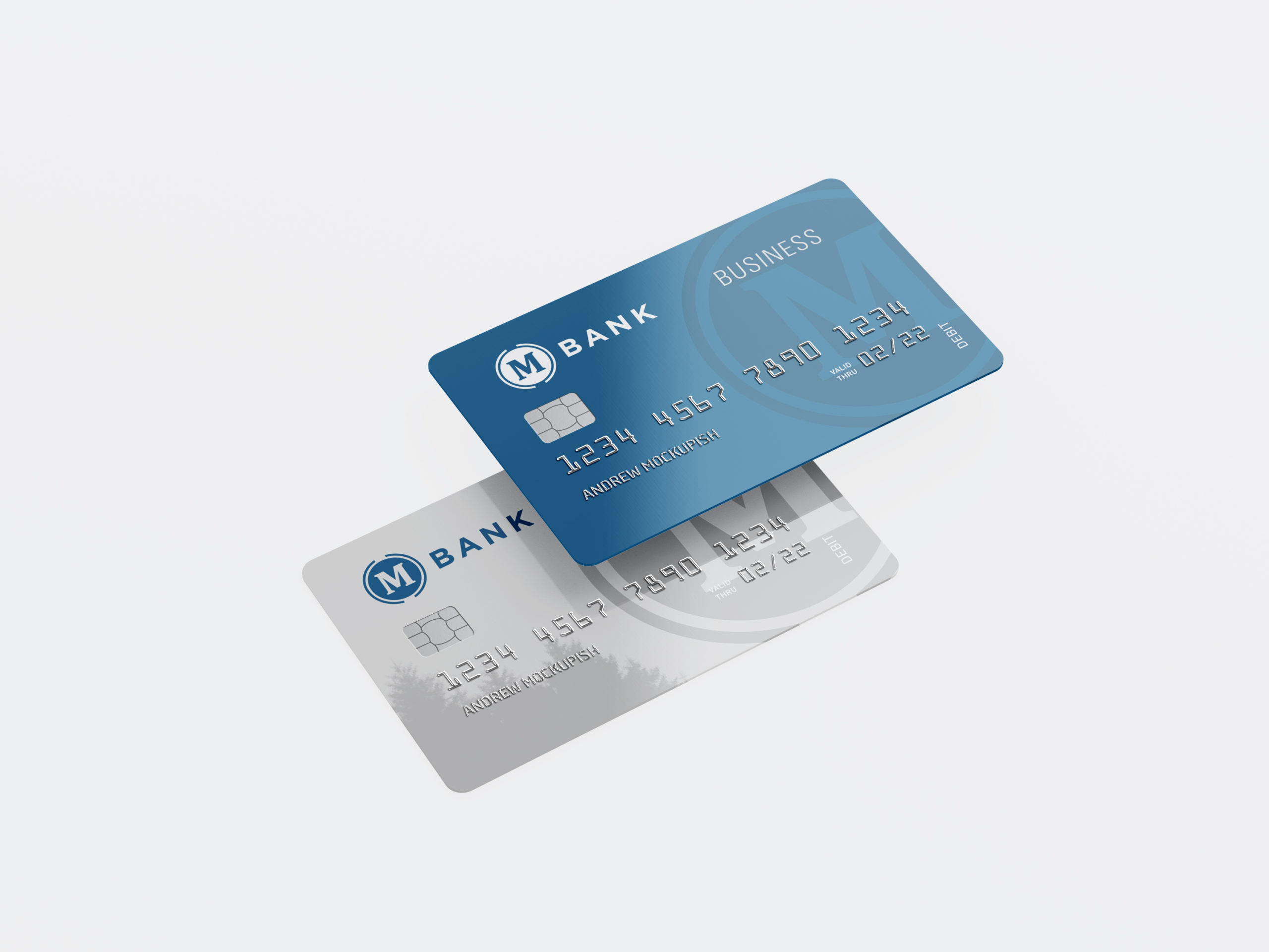
BRANDING
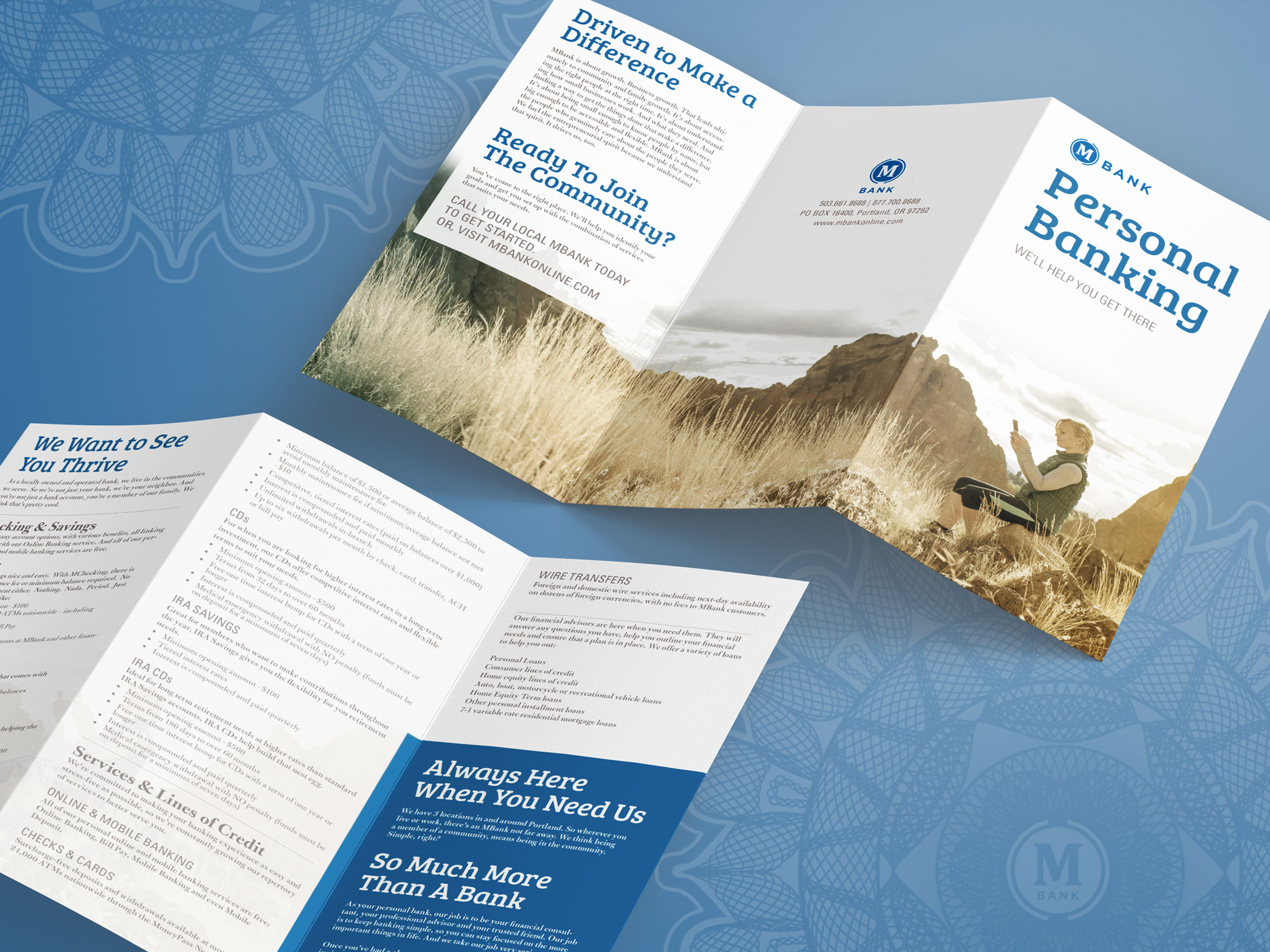
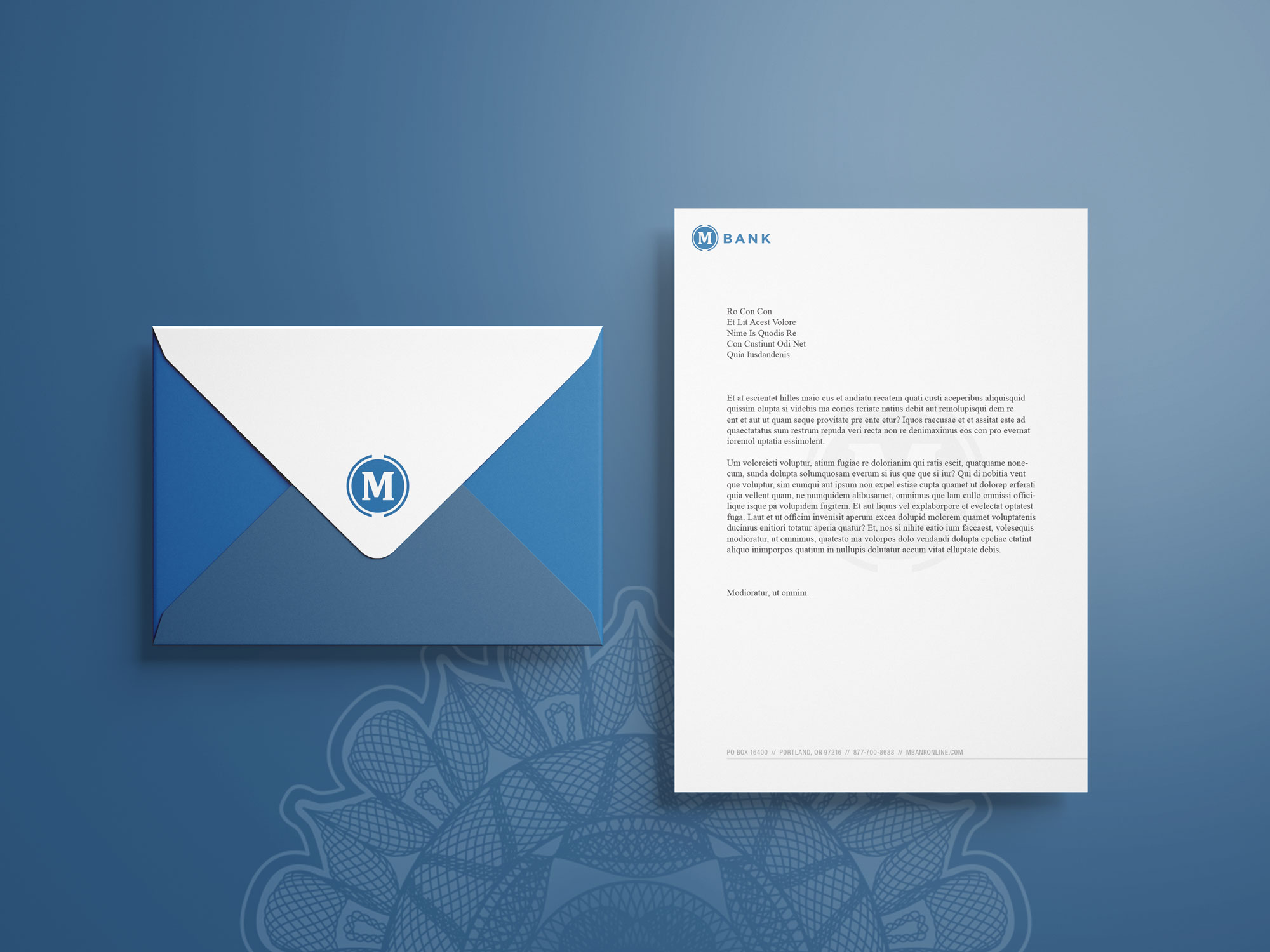
PRINT COLLATERAL
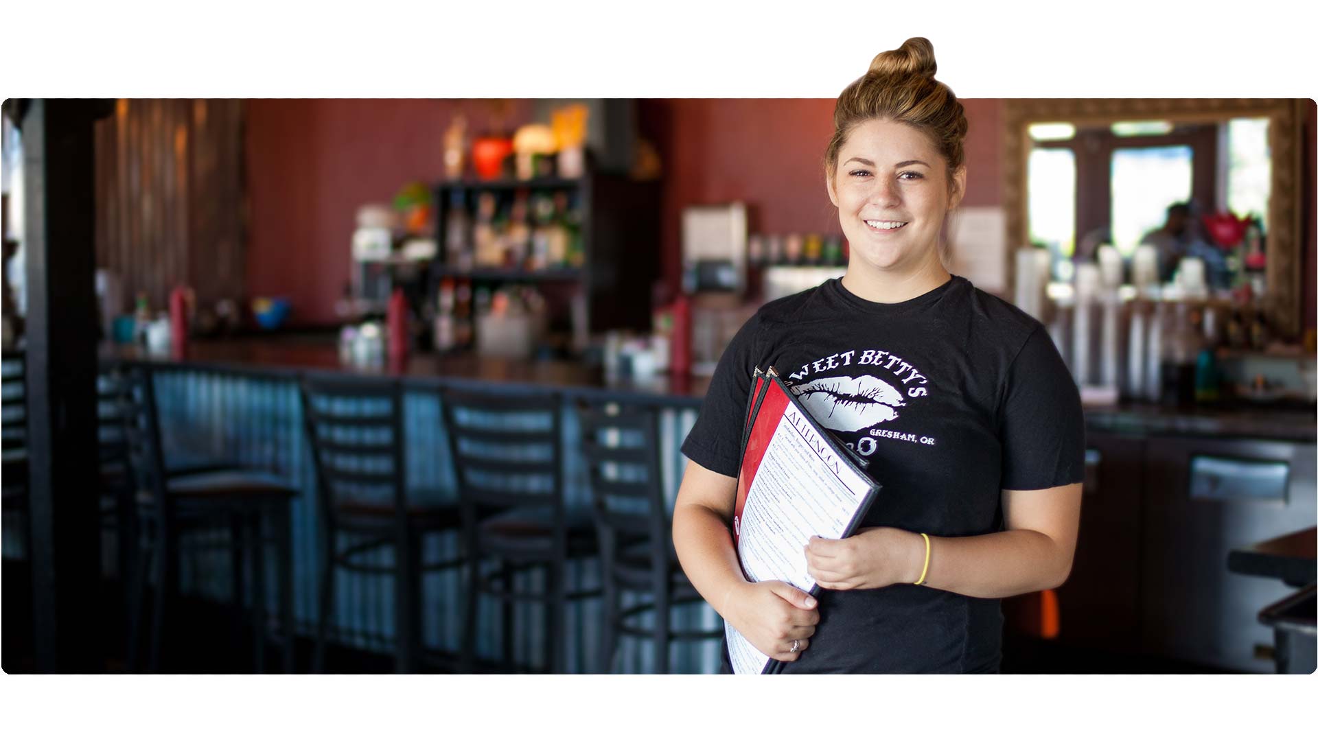
PHOTOGRAPHY
WEB DESIGN
VIDEO PRODUCTION
WEB DESIGN
Putting the user first.
When I embarked on the website project, I recognized the immense opportunity to leverage UX/UI design practices to their fullest potential. My objective was to not only craft a visually stunning brand representation in the digital realm but, more importantly, to deliver the optimal user experience for diverse personas. I am proud to say that I achieved precisely that.


1
USER ACCESS
The homepage serves as a comprehensive hub, providing users with instant access to all the site has to offer, condensed within a single screen. With a focus on speed and convenience, I approached the design of this homepage as more akin to an app, ensuring seamless and efficient navigation for users to find what they need with ease.
2
COMMUNITY VIDEO
At the heart of this bank lies a strong community focus. To enhance the website's personal touch, I incorporated video portraits showcasing local businesses and locations into each hero section. This dynamic addition infuses the website with movement, fostering a sense of connection and making it more personable to visitors.
3
ACCORDIONS
While accordions are not new to the web environment, when utilized effectively, they can be a powerful tool for organizing and condensing information. Given the substantial amount of information typically associated with banks, I implemented a "new age" accordion design to streamline and declutter an otherwise text-heavy website. This approach ensures that users can navigate to their desired destinations more efficiently and with greater ease.
4
CALL TO ACTION
Concluding each page, a subtle yet impactful reminder encourages users to become members if they haven't already. This gentle prompt serves as a catalyst, offering users an effortless pathway to take the next step and easily sign up, ensuring a seamless and user-friendly conversion process.

RESULTS
Since launching our new website and brand, we have received abundant praise from both staff and members. We're also delighted to share that online membership sign-ups have surged significantly. These accomplishments reflect our commitment to delivering an exceptional user experience and meeting the evolving needs of our community.
TAKE AWAYS
This experience has taught me a valuable lesson: websites with abundant content can present an exciting challenge that requires the application of robust UX&UI practices and content strategy to create a streamlined and enjoyable user experience. It has ignited a newfound passion within me for organizing and refining website content. I now recognize the importance of simplifying complexities and ensuring a seamless user journey.